GiveTogether: Empowering Sustainable Change through Waste Reduction
A system designed to make donation accessible, intuitive and easy.
Overview
GiveTogether is a concept project submitted for The CHI 2023 Design: Appropriate Solutions for All, focusing on Sustainable Development Goals of No Poverty and Zero Hunger. It addresses waste caused by inconvenient re-purposing by enabling easy contributions from individuals, businesses, and charities through donations and goods repurposing.
The design has undergone multiple iterations, involving brainstorming, research, and extensive prototyping to effectively address these important issues.
-
Role: Sole UX Designer; Brand Designer; Visual Designer
-
Time: 1 month

SLOGAN
It's clear, inspiring, and aligns well with the project's mission.
Challenge
Our project aims to address the "No Poverty" and "Zero Hunger" sustainability goals by tackling key issues faced by both suppliers and charities. The lack of collaboration between businesses(suppliers) and charities, as well as the cumbersome donation process for individuals, are the main challenges we identified. To solve these problems, we designed an app that allows seamless donations and collaboration with various charities and suppliers.
Their requirements can be summarized as follows:
-
Suppliers have the option to post time and location requirements for their donations, enabling timely contributions of time-sensitive goods like dairy products. What's more, they can also specify the type of donation they are offering, allowing charities to choose more easily.
-
Charities also have the opportunity to post their inventory, aiding individuals in finding what they need on their first visit.
-
Individuals can make seamless one-click donations to a list of available charities. Conveniently filter by location and type, and easily identify high-demand items.
Design
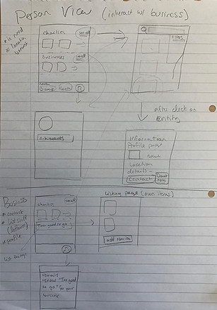
After confirming the requirements, we established the user flow. Following that, I sketched the wireframe.

WIREFRAME SKETCH
The sketch of discussion on how to arrange the perspectives of business, charity, and individual.
After we extensively researched various charity-related apps and gained valuable insights, we observed that warm colors, like orange, are commonly used to convey warmth, friendliness, and a sense of togetherness in these apps. Thus, we chose orange as the main color for our app.
ICON
We chose orange as our main color.
Lastly, we incorporated gamification into the app's design to increase user engagement and foster a sense of achievement. Our achievement system on the Profile page encourages users to donate and contribute to the community, providing them with a sense of accomplishment and pride when they reach milestones.

ACHIEVEMENT SYSTEM on PROFILE
Encouraging users to donate and contribute with achievement system.
Iteration
Due to time constraints, my team and I decided to use Jakob Nielsen's 10 usability heuristics as our evaluation method. Through this approach, we identified the following issues.
-
Avoiding Terminologies in UX Design
Initially, our guidance used unnecessary terminology, violating Jakob Nielsen's "Match between system and the real world" heuristic. The terms "business" and "charity" might confuse users. To address this, we made modifications, changing "business" to "Collect Food" and "charity" to "Collect Item."
-
Information Hierarchy
Our initial design faced issues with the information hierarchy. Various essential information, including time, location, item name, business/charity name, distance, and star ratings, was not clearly displayed and lacked well-defined prioritization.
For instance, the overlapping of the merchant name with the image violated Jakob Nielsen's "aesthetic and minimalist design" heuristic.

BEFORE
AFTER
Before: Charity & Business
After: Collect Item &collect Food
Added a background mask to the store's name
Added the types of services offered by Charity
Added pickup times
The modified parts are marked with red lines.
In the revised version, changes were made to improve the visual hierarchy. The changes included adding a background to the names and using different font styles to create a clearer visual hierarchy.
Final Design
The final prototype consists of two flows:
Flow 1 represents the perspective of individuals, and Flow 2 represents the perspective of businesses. Please click the link to experience it.
INTERACTIVE PROTOTYPE
The video displayes task flows for individuals.